Why Teacher Pay Varies by Region in England (and Why Real Pay Tells a Different Story)
| Estimated reading time: 7 mins
Teacher pay in England is often discussed as if it’s uniform - a national framework with predictable progression. In reality, where you work can change the financial reality of the same role. Regional workforce mix, leadership structures, and cost-of-living differences all shape the averages we see in official datasets.
If you want to explore the numbers region-by-region, use the interactive Teacher Pay Map (England). It shows classroom averages, leadership context, gender splits, and a real-terms view adjusted for regional prices.
Regional pay differences: more than London weighting
London pay uplifts are the obvious driver at the top of the distribution, but the story doesn’t end there. Even outside London, regional averages can differ by several thousand pounds. That’s partly because workforce profiles vary: different regions have different proportions of early-career staff, different phase mixes, and different school structures.
Averages are also sensitive to leadership composition - if a region has a higher share of leadership roles, its overall pay profile can rise even if classroom pay isn’t dramatically different. On the Teacher Pay Map, you can switch between Classroom and Blended (Classroom + Leadership) to see how much leadership changes the picture.
Leadership structures shape regional averages
A key reason regional pay looks “higher” in some areas is that the workforce may include a larger proportion of leadership posts. Regions with more large schools, more complex organisational structures, or more layered leadership teams will show:
- higher average pay in blended views
- a higher leadership share (as a percentage of the workforce)
- more pronounced gaps between classroom-only and blended averages
This is why separating classroom pay from leadership pay matters. A single average can mask what’s really happening: a region may not necessarily pay classroom teachers more - it may simply have a higher leadership density. The Teacher Pay Map makes this visible by showing leadership pay separately in the table, and allowing the blended view on the map.
Leadership share (what it actually means)
The “Leadership share” figure is a headcount-based percentage - the proportion of the recorded workforce in leadership roles (e.g., SLT and leadership group posts) relative to classroom roles in that region. It’s best read as “leadership representation” rather than “promotion odds”.
Gender differences: what the classroom averages can (and can’t) tell us
Teacher pay is often described as more structured and transparent than many professions - but regional data can still show gender differences in average classroom pay. It’s important to interpret this carefully: a gap is not necessarily evidence of unequal pay for equal work, but can reflect differences in:
- Experience and seniority distribution: Regions with a higher proportion of teachers at the top of the Main Pay Range or on the Upper Pay Range will show higher average classroom pay. If one gender is more concentrated in later career stages locally, this can influence the regional averages even where pay scales are applied consistently.
- Part-time and flexible working patterns: Average pay figures are based on full-time equivalent values, but progression and retention patterns can differ by region. Areas with higher rates of part-time working or flexible arrangements may show different average profiles depending on how long teachers remain in post and progress through scales.
- Phase and setting mix: Regions vary in the balance between primary, secondary, and special schools. Because average pay differs between phases - particularly at later career stages - the local mix of school types can affect regional classroom averages.
- Career breaks and return-to-work pathways: Time out of the workforce and the ease of returning at an appropriate pay point can vary across regions and employers. Where career breaks are more common, this can affect the distribution of teachers across pay ranges and therefore the regional averages observed in the data.
One additional factor often discussed in workforce analysis is the prevalence of part-time and flexible working. In England, female teachers are statistically more likely to work part time at some stages of their career. While published pay figures are typically reported on a full-time equivalent basis, differences in working patterns can still influence progression profiles, retention, and the distribution of teachers across pay ranges within a region.
As a result, observed gender differences in average classroom pay should be interpreted as a reflection of workforce structure and career patterns, rather than differences in pay rates for the same role.
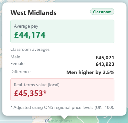
On the Teacher Pay Map, the popup shows male and female classroom averages and describes the difference in a neutral way (e.g., “Men higher by X%” / “Women higher by X%”), rather than implying that a gap is “good” or “bad”.
Cost of living: why “real pay” tells a different story
A £50,000 salary does not buy the same standard of living everywhere. This is where ONS Regional Price Levels (RPLs) are useful. RPLs estimate how expensive different areas are relative to the UK average (UK = 100).
If a region has a price level above 100 (more expensive), then the same salary has less purchasing power. If it’s below 100 (cheaper), pay can stretch further in real terms. The Teacher Pay Map includes a real-terms value in each popup to help you compare salary figures in a more realistic way.
Why national averages can mislead
National averages are useful for big-picture context, but they hide regional structure: leadership representation, the mix of early/late career staff, phase distribution, and local cost-of-living pressures. Two regions might look similar on a single national chart but feel very different in reality.
That’s why regional breakdowns matter. If you’re considering relocation, promotion, or long-term planning, it’s worth exploring the detail behind the headline.
Explore the data yourself
New Teacher Pay Map (England)
Explore how average teacher pay varies by region using official DfE School Workforce Census data, with optional real-terms context.
Explore the map →For pay scale context and how progression works, you may also find these helpful: Teacher Pay Explained and 2025–26 Pay Scales.
Support TeacherPayCalculator
If this website helped you understand your pay or pension, you can support future development and hosting with a one-off Ko-fi donation. The tools here take a huge amount of time and effort to build and maintain – all on top of our teaching jobs! No personal data is ever stored. Made for teachers, by teachers.
If this website helped you, you can support future development and hosting with a one-off Ko-fi donation. Made for teachers, by teachers.
This article is for general information only. Figures are derived from official statistical publications and regional price indices. Always refer to your school or trust pay policy for how national frameworks are applied locally.